

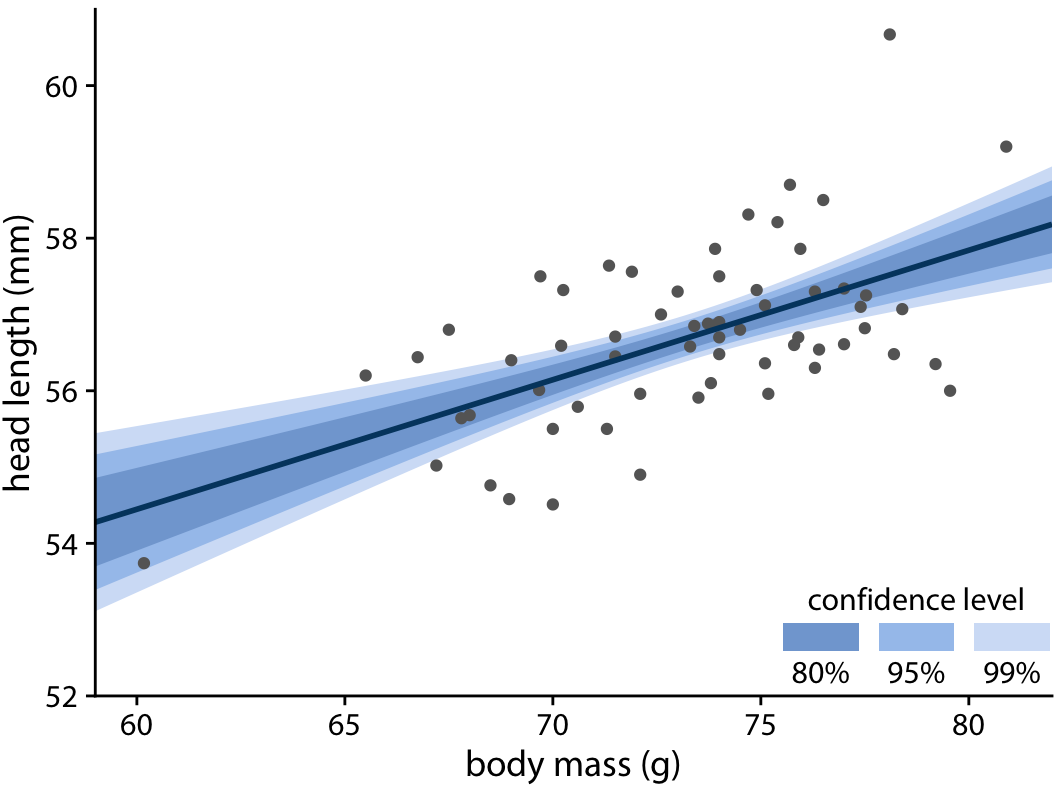
Most dashboards show a single number or a single line, but real world data is noisy. Sampling variation, measurement error, and modelling assumptions mean that a “best estimate” is rarely exact. When uncertainty is hidden, teams over interpret small changes and treat forecasts as promises. Uncertainty charts solve this by showing a plausible range alongside the estimate, so decisions reflect risk as well as trend. This is a practical theme in any data analyst course focused on decision making.
Confidence intervals and prediction bounds: What they mean
A confidence interval (CI) represents uncertainty around an estimated parameter, such as an average order value or a conversion rate. If you repeatedly drew samples and computed intervals the same way, a 95% CI method would capture the true parameter in about 95% of repeated samples. The interval is about the estimate, not about a specific future event.
Prediction bounds, often called prediction intervals (PI), represent uncertainty around an individual future observation. If you forecast tomorrow’s demand, prediction bounds describe where the actual outcome could land, considering both estimation error and natural variation. They are usually wider than confidence intervals because future outcomes vary more than the estimated mean.
Choose based on the question:
- Use CIs for comparing groups and judging whether a change is meaningful.
- Use prediction bounds for planning budgets, capacity, and service levels.
Chart patterns that communicate uncertainty clearly
Error bars and interval plots
Error bars are a direct way to show uncertainty for category comparisons. A clean pattern is a dot for the estimate and a whisker for the interval. This is often clearer than a bar chart with whiskers because bar area can exaggerate differences.
To keep them readable, keep the interval level consistent across charts, avoid aggressively truncated axes, and add a short note when heavy overlap means differences are not decisive.
Ribbons and bands for time series and forecasts
For time series, shaded ribbons around a line are easier to read than many error bars. Use a band to show a CI around the trend, and a wider band for prediction bounds around a forecast. If uncertainty grows with forecast horizon, the band should widen over time. Label the band precisely, for example “95% prediction interval,” so viewers do not confuse it with a confidence interval.
Distribution views for skew and outliers
When the data is skewed or has outliers, a single interval can hide what matters. Box plots and violin plots show spread directly and work well for delivery time, response time, and spend. Add a brief annotation explaining median and quartiles if the audience is unfamiliar.
Design rules that prevent common mistakes
- Name the uncertainty method. Sampling error, measurement error, and model uncertainty are different. State the method in a tooltip or caption, such as “bootstrap 95% CI” or “model based PI.”
- Avoid false precision. Round bounds sensibly. Too many decimals imply certainty that is not present.
- Make thresholds uncertainty aware. If you track a target or SLA line, show how the band relates to it. An estimate below target with a band crossing target suggests the conclusion is not firm.
- Keep colour supportive. The band should support the line, not dominate it. Ensure it remains readable in greyscale by using clear borders and a clear legend.
Implementing uncertainty in dashboards and reports
You can add uncertainty to most reports once you compute lower and upper bounds reliably.
- In spreadsheets, build CIs from standard error and t based formulas for small samples. For proportions, use an appropriate binomial approach. For prediction bounds, use regression or forecasting outputs that provide interval estimates, and document key assumptions.
- In BI tools, plot three series: estimate, lower bound, and upper bound. Fill the area between bounds to create a ribbon. Use tooltips to define whether the band is a CI or a PI.
- In notebook workflows, bootstrapping is practical when formulas are complex or assumptions are uncertain. For prediction bounds, quantile based methods can produce bands that match observed variability.
This applied judgement is emphasised in a data analyst course in Pune, because the goal is not only to compute intervals, but to choose the right uncertainty view for the business question.
Conclusion
Uncertainty visualisation makes analytics more trustworthy. Confidence intervals help you understand how reliable an estimate is, while prediction bounds help you plan for what could actually happen. With clear encodings such as error bars, ribbons, and distribution charts, and with consistent labels and interval levels, stakeholders can act with appropriate confidence. These habits strengthen reporting in any practical data analytics course, and they give analysts trained through a data analyst course in Pune a clear advantage in communicating risk responsibly.
Contact Us:
Name: Elevate Data Analytics
Address: Office no 403, 4th floor, B-block, East Court Phoenix Market City, opposite GIGA SPACE IT PARK, Clover Park, Viman Nagar, Pune, Maharashtra 411014
Phone No.: 095131 73277
